A label can have beautiful typography, a considered palette, and a very ordinary square dropped into its corner. It works, but it feels like the design stopped one step too early.
A branded QR is an opportunity to finish the thought. It should feel at home on the thing carrying it—and make the next step obvious. That doesn’t mean every code needs elaborate artwork. It means the code, the invitation, and the destination should tell the same story.
Start with the moment, not the pattern
Before choosing a color, describe the situation. Someone might scan a bottle in a shop, a poster in a dark venue, or a menu on a sunny terrace. Those are different design problems.
Write a short brief with four answers: who is scanning, what they’re looking at, what they expect to happen, and what success looks like. “Open the ingredients list while holding the product” gives a designer a clearer target than “make it more on-brand.” It also tells you what needs to be easy on the destination page.
The call to action deserves the same care. “See what’s inside” makes a promise. “Scan me” simply names an action. Choose the phrase that gives a person a good reason to take out their phone.
Pick a visual direction with a reason
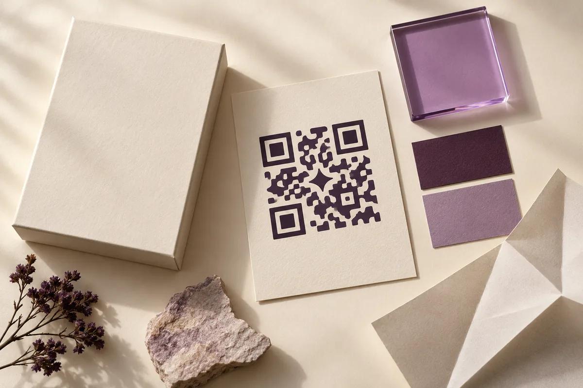
Think in materials and character as well as colors. A botanical brand might use soft, organic forms and a restrained green palette. A music event might feel metallic and energetic. A technology brand might explore translucent geometry and light. The differences should come from the brand, not from a random effect applied at the end.
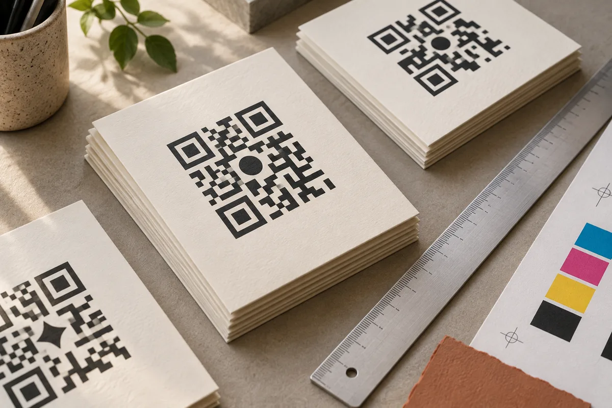
Our homepage shows these as concept art directions. They help communicate a visual idea; they are not production-ready, encoded QR symbols. Turning an art direction into a working code requires preserving the encoded structure and validating the result.
For a simpler job, a conventional code in a considered color, paired with good typography and a useful destination, may already be the right answer. Try the free QR generator to explore that starting point.
Protect the parts that do the work
The small squares in a QR symbol are modules. The large corner patterns help a reader locate and orient it. Decoration must not make that structure ambiguous.
Keep a clear margin around the symbol. DENSO WAVE specifies a four-module quiet zone on each side of a QR code. Treat that space as part of the artwork, not spare room for a caption. DENSO WAVE’s sizing guidance explains the relationship between module size, symbol size, and margin.
Choose strong contrast and avoid letting textures, reflective finishes, or nearby graphics compete with the code. Error correction should not be treated as a blanket permission to cover any part of the symbol with a logo. Test the exact design you intend to use.
Design the destination too
The scan is a handoff. If the code promises a menu, the next screen should make the menu easy to find. If it promises a product story, don’t land people on an unrelated homepage and ask them to start again.
Keep the first screen focused, make important actions usable with one hand, and consider the connection quality of the real location. Match the visual language to the thing the person just scanned. This is where a branded interaction becomes an experience rather than a decoration.
Make a proof before making a thousand
Export clean artwork, print one physical sample, and test it where it will actually live. Use more than one phone. Try the expected distance and a few less-than-perfect angles. Check the final surface, not just a flat office printout.
If it fails, simplify before you embellish: restore contrast, increase size, clear the border, and reduce visual interference. Our print guide turns that review into a practical checklist.
A good branded QR earns its place twice: it belongs in the design, and it gets people where they expected to go.